
CLIENT

DELIVERABLES
*All footage is originally shot*
Instagram Feed: *updated August '26*
Instagram Reels (10+)
Instagram Posts (30+)
Instagram Stories (10+)
Other assets:
Brunch Menu Design
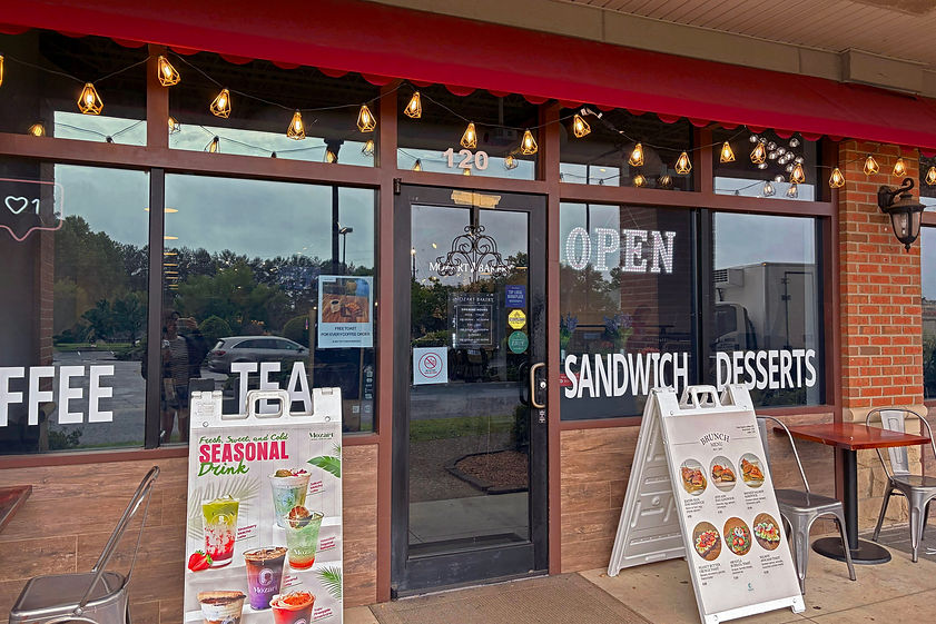
OOH Banner (placed in-front of store)
OBJECTIVE
To build a new modern and creative image of the brand, increasing consumer awareness and engagement across consumers within Atlanta and, eventually, increase in-store traffic.
MY ROLE
As the social content creator and brand strategist, I managed the primary social media asset of the brand - Instagram, creating a content calendar that will enhance the brand and provide a new clear art direction. The new brand strategy aims to build a seamless and engaging consumer experience for existing and new consumers to not only inform but also entertain the consumers of Mozart Bakery as a warm and welcoming brand.
GOALS

THE MENU
Showcase the menu items in an aesthetic and appetizing way

THE TREND
Encompass the reel trends the
target audience resonates with

THE EXPERIENCE
Show the authentic in-store experience through social media
INSTAGRAM FEED
.png)


THE DIRECTION

.png)
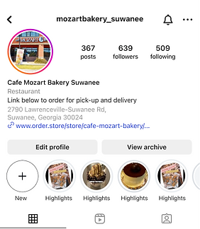
AFTER
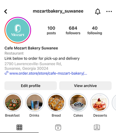
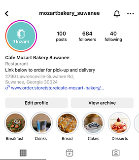
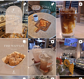
The Instagram feed (LEFT) lacks engagement due to static, AI-generated visuals that fail to capture the authentic café experience. This disconnected brand identity gives followers little reason to engage online or visit in person, hindering foot traffic and overall interest.
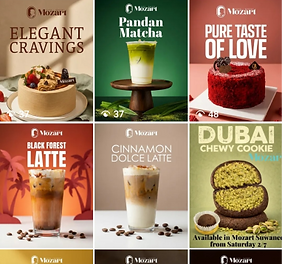
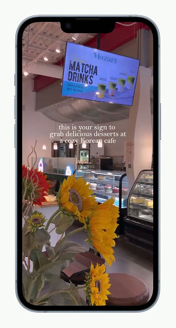
The refreshed feed (RIGHT) introduces a modern, creative direction that positions Mozart Bakery as a welcoming yet professional brand. With organized profile highlights showcasing signature breads and desserts alongside a dynamic mix of reels, GIFs, and posts, the new strategy boosts engagement both online and in-store.
BEFORE
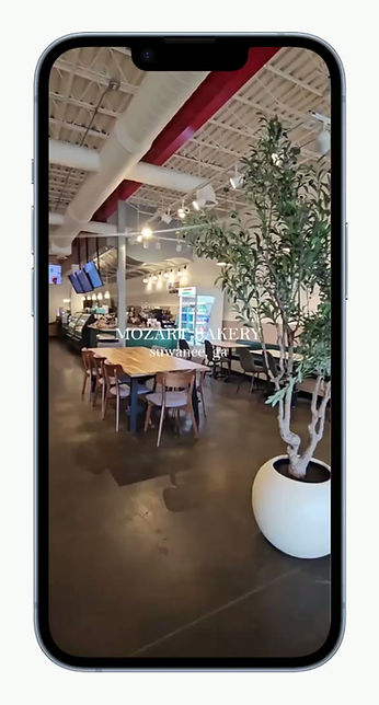
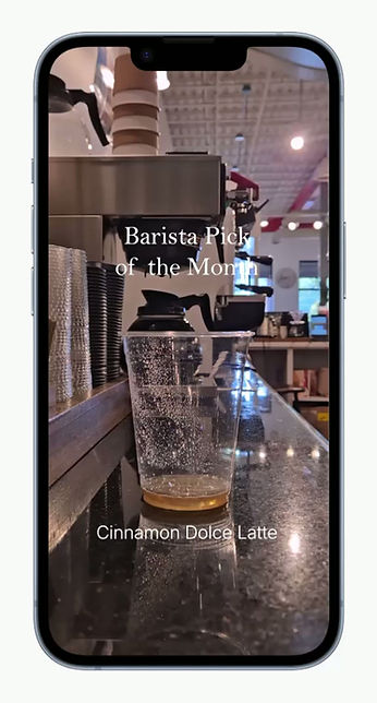
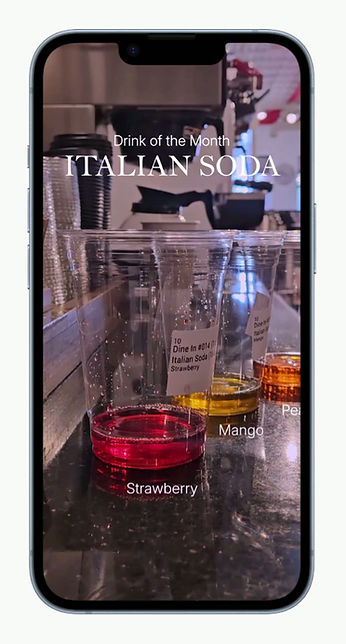

2000+
views
4800+
views
THE CONTENT
BRUNCH MENU
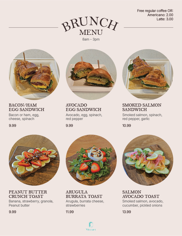
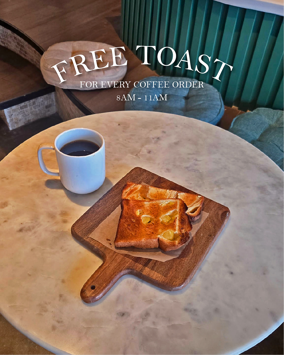
A new brunch menu was designed with the release of new brunch menu items.
Clean and concise, easy-to-read text, big photography, and a minimalistic design to match the tone of the brand refresh.
Furthermore, a flyer introduces a toast deal with a purchase of coffee to entice customers for a morning coffee.
Menus were printed and strategically placed at the storefront and beside the register, giving customers a clear overview of the food options.

